




🇦🇿 Azərbaycanca | 🇮🇩 Bahasa Indonesia | 🇰🇷 한국어 | 🇻🇳 Tiếng Việt | 🇨🇳 简体中文 | 🇺🇸 English





If you find this useful, consider supporting the project:

Other projects
NextLevelBuilder.io | GoClaw.sh | AgentKit.best | TOSE.sh
Check Out Our New Skill:

Turn an idea into a 3D scene worth exploring.
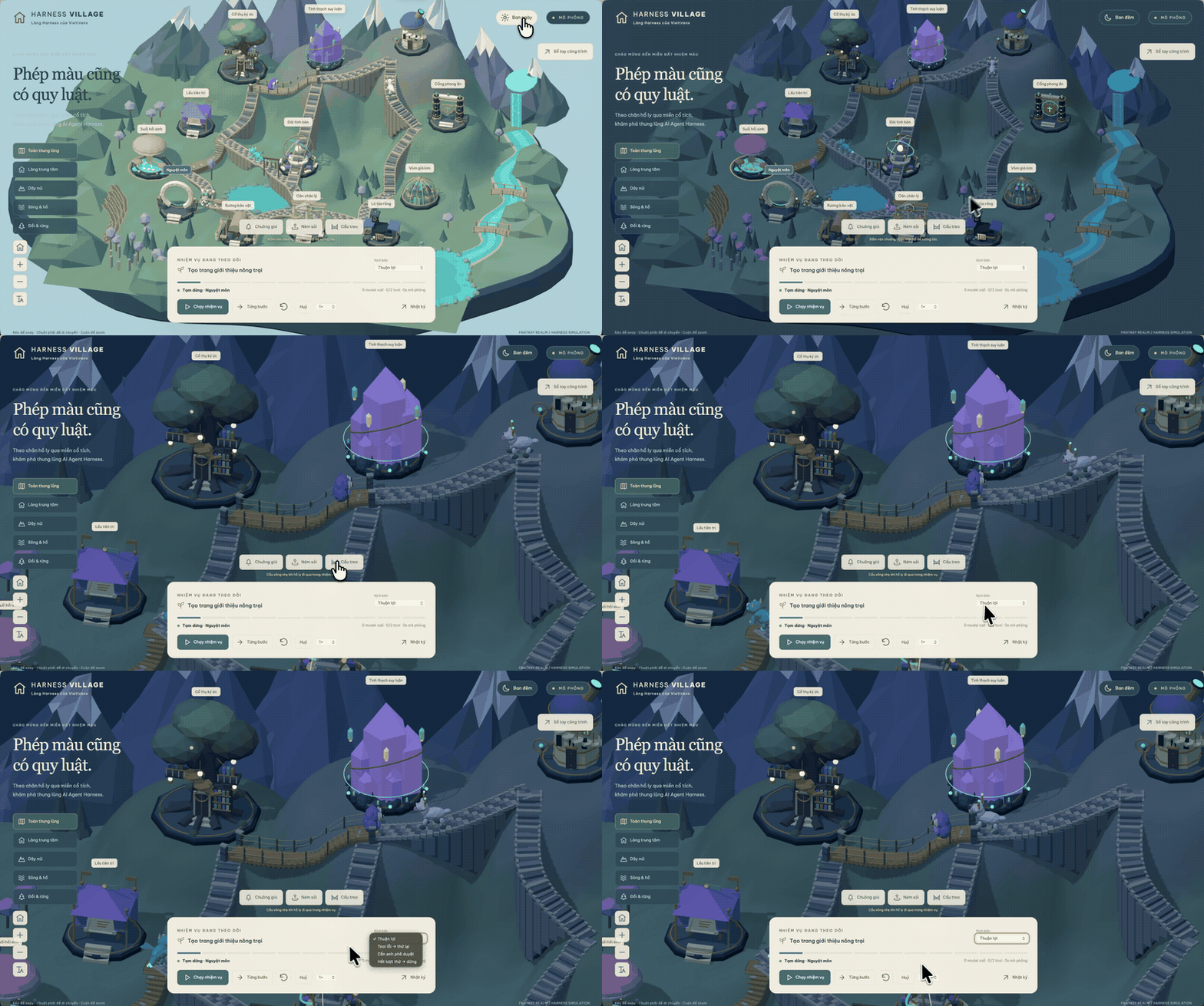
Visual inspiration, not a benchmark. An author-supplied project recorded before this skill existed; its UI contains Vietnamese. Historical footage, not an English demo or a runtime test of the skill — see media provenance.
🤌 Website: https://3dviz.dev/
--- ## What's New in v2.0 ### Intelligent Design System Generation The flagship feature of v2.0 is the **Design System Generator** - an AI-powered reasoning engine that analyzes your project requirements and generates a complete, tailored design system in seconds. ``` +----------------------------------------------------------------------------------------+ | TARGET: Serenity Spa - RECOMMENDED DESIGN SYSTEM | +----------------------------------------------------------------------------------------+ | | | PATTERN: Hero-Centric + Social Proof | | Conversion: Emotion-driven with trust elements | | CTA: Above fold, repeated after testimonials | | Sections: | | 1. Hero | | 2. Services | | 3. Testimonials | | 4. Booking | | 5. Contact | | | | STYLE: Soft UI Evolution | | Keywords: Soft shadows, subtle depth, calming, premium feel, organic shapes | | Best For: Wellness, beauty, lifestyle brands, premium services | | Performance: cost:low | Accessibility: risk:conditional; verify requirements | | | | COLORS: | | Primary: #E8B4B8 (Soft Pink) | | Secondary: #A8D5BA (Sage Green) | | CTA: #D4AF37 (Gold) | | Background: #FFF5F5 (Warm White) | | Text: #2D3436 (Charcoal) | | Notes: Calming palette with gold accents for luxury feel | | | | TYPOGRAPHY: Cormorant Garamond / Montserrat | | Mood: Elegant, calming, sophisticated | | Best For: Luxury brands, wellness, beauty, editorial | | Google Fonts: https://fonts.google.com/share?selection.family=... | | | | KEY EFFECTS: | | Soft shadows + Context-appropriate transitions + Gentle hover states | | | | AVOID (Anti-patterns): | | Bright neon colors + Harsh animations + Dark mode + AI purple/pink gradients | | | | PRE-DELIVERY CHECKLIST: | | [ ] No emojis as icons (use SVG: Heroicons/Lucide) | | [ ] cursor-pointer on all clickable elements | | [ ] Interaction timing follows the platform, component, and user preference | | [ ] Light mode: text contrast 4.5:1 minimum | | [ ] Focus states visible for keyboard nav | | [ ] prefers-reduced-motion respected | | [ ] Text, chips, and badges reflow without clipping or broken labels | | [ ] Responsive: 375px, 768px, 1024px, 1440px | | | +----------------------------------------------------------------------------------------+ ``` ### How Design System Generation Works ``` ┌─────────────────────────────────────────────────────────────────┐ │ 1. USER REQUEST │ │ "Build a landing page for my beauty spa" │ └─────────────────────────────────────────────────────────────────┘ │ ▼ ┌─────────────────────────────────────────────────────────────────┐ │ 2. MULTI-DOMAIN SEARCH (5 parallel searches) │ │ • Product type matching (192 categories) │ │ • Style recommendations (79 searchable; 50 active) │ │ • Color palette selection (192 palettes) │ │ • Landing page patterns (34 patterns) │ │ • Typography pairing (74 font combinations) │ └─────────────────────────────────────────────────────────────────┘ │ ▼ ┌─────────────────────────────────────────────────────────────────┐ │ 3. REASONING ENGINE │ │ • Match product → UI category rules │ │ • Apply style priorities (BM25 ranking) │ │ • Filter anti-patterns for industry │ │ • Process decision rules (JSON conditions) │ └─────────────────────────────────────────────────────────────────┘ │ ▼ ┌─────────────────────────────────────────────────────────────────┐ │ 4. COMPLETE DESIGN SYSTEM OUTPUT │ │ Pattern + Style + Colors + Typography + Effects │ │ + Anti-patterns to avoid + Pre-delivery checklist │ └─────────────────────────────────────────────────────────────────┘ ``` ### 192 Industry-Specific Reasoning Rules The reasoning engine includes specialized rules for: | Category | Examples | |----------|----------| | **Tech & SaaS** | SaaS, Micro SaaS, B2B Service, Developer Tool / IDE, AI/Chatbot Platform, Cybersecurity Platform | | **Finance** | Fintech/Crypto, Banking, Insurance, Personal Finance Tracker, Invoice & Billing Tool | | **Healthcare** | Medical Clinic, Pharmacy, Dental, Veterinary, Mental Health, Medication Reminder | | **E-commerce** | General, Luxury, Marketplace (P2P), Subscription Box, Food Delivery | | **Services** | Beauty/Spa, Restaurant, Hotel, Legal, Home Services, Booking & Appointment | | **Creative** | Portfolio, Agency, Photography, Gaming, Music Streaming, Photo/Video Editor | | **Lifestyle** | Habit Tracker, Recipe & Cooking, Meditation, Weather, Diary, Mood Tracker | | **Emerging Tech** | Web3/NFT, Spatial Computing, Quantum Computing, Autonomous Drone Fleet | Each rule includes: - **Recommended Pattern** - Landing page structure - **Style Priority** - Best matching UI styles - **Color Mood** - Industry-appropriate palettes - **Typography Mood** - Font personality matching - **Key Effects** - Animations and interactions - **Anti-Patterns** - What NOT to do (e.g., "AI purple/pink gradients" for banking) ## Features - **79 Searchable UI Styles (50 active)** - Glassmorphism, Claymorphism, Minimalism, Brutalism, Neumorphism, Bento Grid, Dark Mode, AI-Native UI, and more - **192 Color Palettes** - Industry-specific palettes aligned 1:1 with the 192 product types - **74 Font Pairings** - Curated typography combinations with Google Fonts imports - **25 Chart Types** - Recommendations for dashboards and analytics - **22 Tech Stacks** - React, Next.js, Astro, Vue, Nuxt.js, Nuxt UI, Svelte, SwiftUI, React Native, Flutter, HTML+Tailwind, shadcn/ui, Jetpack Compose, Angular, Laravel, Three.js, JavaFX, WPF, WinUI 3, UWP, Avalonia, Uno Platform - **119 UX Guidelines** - Best practices, anti-patterns, accessibility rules, resilient text layout, compact labels, and cancellable interactions - **192 Reasoning Rules** - Industry-specific design system generation (NEW in v2.0) ### Resilient Text and Compact UI The guidance now covers common production failures around headings, long tokens, chips, badges, and interrupted micro-interactions: - Balanced heading wrapping is a progressive enhancement, not a guarantee that a specific word will remain on the last line. Designs must still work with natural wrapping across widths, fonts, and locales. - Essential text must reflow without clipping at narrow widths, browser zoom, text scaling, and user spacing overrides. Long URLs and identifiers may wrap safely. - Chip and tag collections should wrap or use an operable `+n` disclosure. A compact label should remain whole when practical; unavoidable truncation needs an accessible full-value path for keyboard, pointer, and touch users. - Badge meaning cannot rely on color alone. Interactive chips need native semantics, visible focus, and programmatic state; live counts need meaningful context. - Rapid interactions may cancel animation, but the final semantic state, focus, and content must remain correct. Timing is selected for the platform and component, with reduced-motion preferences respected. ### Style Taxonomy The catalog contains **79 searchable styles** backed by stable IDs and aliases: | Status | Count | Search behavior | |--------|------:|-----------------| | Active | 50 | Included in normal recommendations and shown by default in the gallery | | Supplemental | 29 | Returned for exact or explicit variant/system intent; available through the gallery status filter | | Deprecated | 9 | Excluded from normal ranking; legacy names redirect to a canonical style or landing pattern | The active set covers 43 general visual families, 2 mobile-specific styles, 3 official platform/design systems, 1 platform material, and 1 core analytics style. Current official systems include Fluent 2, Shopify Polaris, and Adobe Spectrum; Liquid Glass is scoped as an Apple platform material, Material 3 Expressive remains a mobile Material variant, and Spectrum 2 is supplemental. Landing-page structures live in the separate 34-pattern landing dataset rather than competing with visual styles in BM25 ranking. See [`styles.csv`](src/ui-ux-pro-max/data/styles.csv) for the full taxonomy and provenance-aware metadata. ## 💎 Basic vs. Premium Version Comparison Many users ask about the differences between the open-source and premium versions. Here is a detailed breakdown to help you choose the right fit for your workflow. ### 🟢 Basic Version (This Repository) * **Fully Open Source:** Perfect for individual developers, hobbyists, and standard projects. * **Core UI/UX Intelligence:** Full access to 79 searchable UI styles (50 active), 192 product types, color palettes, and curated font pairings. * **Smart Recommendations:** Built-in BM25 search engine for highly accurate design matching. * **Cross-Platform Support:** Stack-specific guidelines supporting 22 major frameworks (React, Vue, Tailwind, iOS, Android, etc.). * **Design System Generation:** Instantly generate tailored UI rules, patterns, and logic via CLI. ### 🟡 Premium Version * **Extended Brand Design Skills:** Goes beyond UI/UX to include Brand Identity generation, Logo Design, Corporate Identity Programs (CIP), Banners, Presentation Slides, and custom Iconography. * **Advanced Asset Creation:** Deep integration with AI-powered image generation to create real visual assets, not just placeholders. * **Enterprise Architecture:** A more comprehensive and scalable Design Token architecture, built for large-scale team deployments. * **Priority Support:** Dedicated technical assistance for teams and professionals who need an uninterrupted full design workflow. 👉 *For more details on upgrading to the Premium tier, visit [uupm.cc](https://uupm.cc).* ## Installation ### Using Claude Marketplace (Claude Code) Install directly in Claude Code with two commands: ``` /plugin marketplace add nextlevelbuilder/ui-ux-pro-max-skill /plugin install ui-ux-pro-max@ui-ux-pro-max-skill ``` ### Using CLI (Recommended) ```bash # Install CLI globally npm install -g ui-ux-pro-max-cli # Go to your project cd /path/to/your/project # Install for your AI assistant uipro init --ai claude # Claude Code uipro init --ai cursor # Cursor uipro init --ai windsurf # Windsurf uipro init --ai antigravity # Antigravity uipro init --ai copilot # GitHub Copilot uipro init --ai kiro # Kiro uipro init --ai codex # Codex CLI uipro init --ai qoder # Qoder uipro init --ai roocode # Roo Code uipro init --ai gemini # Gemini CLI uipro init --ai trae # Trae uipro init --ai opencode # OpenCode uipro init --ai continue # Continue uipro init --ai codebuddy # CodeBuddy uipro init --ai droid # Droid (Factory) uipro init --ai kilocode # KiloCode uipro init --ai warp # Warp uipro init --ai augment # Augment uipro init --ai codewhale # CodeWhale uipro init --ai zcode # ZCode uipro init --ai kimi # Kimi Code uipro init --ai amazonq # Amazon Q Developer uipro init --ai openclaw # OpenClaw (.agents/skills/) uipro init --ai universal # Universal / Agent Standard (.agents/skills/) uipro init --ai all # All assistants ``` The npm package is `ui-ux-pro-max-cli`; it still installs the `uipro` command. Older `uipro-cli` releases are stale and should not be used for current assets. ### Global Install (Available for All Projects) ```bash uipro init --ai claude --global # Install to ~/.claude/skills/ uipro init --ai cursor --global # Install to ~/.cursor/skills/ uipro init --ai zcode --global # Install to ~/.zcode/skills/ uipro init --ai kimi --global # Install to ~/.kimi-code/skills/ uipro init --ai universal --global # Install to ~/.agents/skills/ ``` ### Other CLI Commands ```bash uipro versions # List available versions uipro update # Refresh skill files from installed CLI package uipro update --global # Refresh global skill files from installed CLI package uipro init --offline # Compatibility flag; installs bundled templates uipro init --dry-run # Preview install actions without writing files uipro uninstall # Remove skill (auto-detect platform) uipro uninstall --ai claude # Remove specific platform uipro uninstall --global # Remove from global install ``` ## Prerequisites Python 3.x is required for the search script (standard library only — the scripts install nothing and make no network calls). Check if Python is installed: ```bash python3 --version ``` If it is missing, install it yourself from [python.org](https://www.python.org/downloads/) or with your OS package manager (Homebrew, apt, winget). These install steps are for **you, the human user** — AI agents using this skill should never install software on your machine; they are instructed to ask you instead. ## Usage ### Skill Mode (Auto-activate) **Supported:** Claude Code, Cursor, Windsurf, Antigravity, Codex CLI, Continue, Gemini CLI, OpenCode, Qoder, CodeBuddy, Droid (Factory), KiloCode, Warp, Augment, CodeWhale, ZCode, Kimi Code, Amazon Q Developer, OpenClaw, GitHub Copilot The skill activates automatically when you request UI/UX work. Just chat naturally: ``` Build a landing page for my SaaS product ``` > **Trae**: Switch to **SOLO** mode first. The skill will activate for UI/UX requests. ### Workflow Mode (Slash Command) **Supported:** Kiro, Roo Code, KiloCode Use the slash command to invoke the skill: ``` /ui-ux-pro-max Build a landing page for my SaaS product ``` ### Example Prompts ``` Build a landing page for my SaaS product Create a dashboard for healthcare analytics Design a portfolio website with dark mode Make a mobile app UI for e-commerce Build a fintech banking app with dark theme ``` ### Apply a theme to an existing app After [installing the skill](#installation), open your app in your AI assistant and use a prompt like this. In Workflow Mode, prefix it with `/ui-ux-pro-max`. ```text Use the ui-ux-pro-max skill to retheme my existing React app. Target style: Minimalism & Swiss Style. First inspect the framework and styling-library versions, routes, components, styles, and existing theme tokens. Keep the current component structure, behavior, and business logic. Reuse and update the existing semantic tokens for colors, typography, spacing, radii, shadows, and interaction states; add missing tokens rather than creating a parallel theme system. Replace hard-coded styles one component at a time. Verify contrast, keyboard focus, responsive layouts, and all supported light/dark modes. Summarize changed files and any remaining hard-coded styles. ``` Replace `Minimalism & Swiss Style` with your preferred [catalog style](src/ui-ux-pro-max/data/styles.csv) or visual direction. Search results provide design guidance; they do not automatically rewrite your app. **Theme migration checklist:** - **Audit:** Find theme-related hard-coded values in stylesheets, inline styles, and utilities such as `bg-blue-600` or `text-[#1e293b]`. - **Map:** Reuse semantic roles such as `background`, `surface`, `foreground`, `primary`, `border`, and `ring` in the app's existing styling system. Add missing roles using its installed library version's conventions. - **Migrate:** Replace hard-coded values with token references in small component batches. Changing tokens alone will not affect styles that do not use them. - **Verify:** Check text/UI contrast, hover/focus/disabled states, responsive layouts, and each supported theme after every batch. ### How It Works 1. **You ask** - Request any UI/UX task (build, design, create, implement, review, fix, improve) 2. **Design System Generated** - The AI automatically generates a complete design system using the reasoning engine 3. **Smart recommendations** - Based on your product type and requirements, it finds the best matching styles, colors, and typography 4. **Code generation** - Implements the UI with proper colors, fonts, spacing, and best practices 5. **Pre-delivery checks** - Validates against common UI/UX anti-patterns ### Supported Stacks The skill provides stack-specific guidelines for: | Category | Stacks | |----------|--------| | **Web (HTML)** | HTML + Tailwind (default) | | **React Ecosystem** | React, Next.js, shadcn/ui | | **Vue Ecosystem** | Vue, Nuxt.js, Nuxt UI | | **Angular** | Angular | | **PHP** | Laravel (Blade, Livewire, Inertia.js) | | **Other Web** | Svelte, Astro, Three.js | | **Desktop** | JavaFX, WPF, WinUI 3, Avalonia, Uno Platform, UWP | | **iOS** | SwiftUI | | **Android** | Jetpack Compose | | **Cross-Platform** | React Native, Flutter | Just mention your preferred stack in the prompt, or let it default to HTML + Tailwind. ## Examples ### Before/after: ops dashboard A plain ops dashboard ([before](https://skill-fixture-before.theroost.dev)) restyled using only the design system UI UX Pro Max generated for it ([after](https://ui-ux-pro-max-after.theroost.dev)), from `search.py "internal operations dashboard" --design-system --density 8 --motion 3 --variance 4`. *Illustrative, community-contributed example; not an official demo, benchmark, or runtime test of the skill.* ## Design System Command (Advanced) For direct access to the design system generator: > Note: If you installed via Continue, replace `.claude/skills/` with `.continue/skills/` in the commands below. For Droid (Factory), use `.factory/skills/`. For ZCode, use `.zcode/skills/`. For Amazon Q Developer, use `.amazonq/skills/` (Amazon Q only auto-loads the rule at `.amazonq/rules/ui-ux-pro-max.md`; the data and scripts under `.amazonq/skills/` are files the rule points to). ```bash # Generate design system with ASCII output python3 .claude/skills/ui-ux-pro-max/scripts/search.py "beauty spa wellness" --design-system -p "Serenity Spa" # Generate with Markdown output python3 .claude/skills/ui-ux-pro-max/scripts/search.py "fintech banking" --design-system -f markdown # Domain-specific search python3 .claude/skills/ui-ux-pro-max/scripts/search.py "glassmorphism" --domain style python3 .claude/skills/ui-ux-pro-max/scripts/search.py "elegant serif" --domain typography python3 .claude/skills/ui-ux-pro-max/scripts/search.py "dashboard" --domain chart python3 .claude/skills/ui-ux-pro-max/scripts/search.py "error summary validation" --domain ux python3 .claude/skills/ui-ux-pro-max/scripts/search.py "decorative icon aria hidden" --domain icons python3 .claude/skills/ui-ux-pro-max/scripts/search.py "icon button accessible label" --domain icons python3 .claude/skills/ui-ux-pro-max/scripts/search.py "orphan heading line balance" --domain ux python3 .claude/skills/ui-ux-pro-max/scripts/search.py "badge chip label wraps to second line" --domain ux python3 .claude/skills/ui-ux-pro-max/scripts/search.py "rapid chip animation interrupted" --domain ux # Stack-specific guidelines python3 .claude/skills/ui-ux-pro-max/scripts/search.py "form validation" --stack react python3 .claude/skills/ui-ux-pro-max/scripts/search.py "responsive layout" --stack html-tailwind python3 .claude/skills/ui-ux-pro-max/scripts/search.py "chip badge overflow nowrap" --stack html-tailwind python3 .claude/skills/ui-ux-pro-max/scripts/search.py "tableview binding" --stack javafx python3 .claude/skills/ui-ux-pro-max/scripts/search.py "atlantafx primer enterprise theme" --stack javafx python3 .claude/skills/ui-ux-pro-max/scripts/search.py "enterprise tableview density permission" --stack javafx ``` Web-stack search is version-aware. Queries without an older major return current, active guidance. Explicit legacy terms or older majors (for example, `Svelte 4` or `Next.js 15`) return only curated legacy rows, labeled by `Status` and `Applies To`; when no matching legacy guidance is curated, search returns no results instead of mixing framework generations. ### Persist Design System (Master + Overrides Pattern) Save your design system to files for **hierarchical retrieval across sessions**: ```bash # Generate and persist to design-system/myapp/MASTER.md python3 .claude/skills/ui-ux-pro-max/scripts/search.py "SaaS dashboard" --design-system --persist -p "MyApp" # Also create a page-specific override file python3 .claude/skills/ui-ux-pro-max/scripts/search.py "SaaS dashboard" --design-system --persist -p "MyApp" --page "dashboard" ``` This creates a `design-system/` folder structure: ``` design-system/ └── myapp/ # One folder per project (slug of -p "MyApp") ├── MASTER.md # Global Source of Truth (colors, typography, spacing, components) └── pages/ └── dashboard.md # Page-specific overrides (only deviations from Master) ``` **How hierarchical retrieval works:** 1. When building a specific page (e.g., "Checkout"), first check `design-system/[project-slug]/pages/checkout.md` 2. If the page file exists, its rules **override** the Master file 3. If not, use `design-system/[project-slug]/MASTER.md` exclusively **Context-aware retrieval prompt:** ``` I am building the [Page Name] page. Please read design-system/[project-slug]/MASTER.md. Also check if design-system/[project-slug]/pages/[page-name].md exists. If the page file exists, prioritize its rules. If not, use the Master rules exclusively. Now, generate the code... ``` ## Architecture & Contributing ### For Users The codebase has been restructured to use a **template-based generation system**. All platform-specific files (`.cursor/`, `.windsurf/`, `.kiro/`, `.factory/`, etc.) are now generated dynamically by the CLI. **Always use the CLI to install:** ```bash npm install -g ui-ux-pro-max-cli uipro init --ai